
Made in KG / Producer-country branding
Made in Mountains
A country-of-origin mark, yellow and red stripes, and a creative strategy built around mountains and pride. A producer-country brand concept connecting products, retail shelves and communications.
The Kyrgyz Republic does not need sympathy. It needs visibility.
01/ The challenge: make origin visible
Kyrgyz products come from many different makers, categories and routes to market. We saw an opportunity to connect them through a recognisable shared language — on the product, in the store and in communications. Each encounter should build recognition of Kyrgyzstan as a producer country.
Made in Mountains proposes a confident, contemporary identity for local production. Its communication goal is to spark interest in the product and pride in its origin. Mountains become a shared theme that can be expressed through the distinctive qualities of different products.
02/ The mark: a compact signature of origin
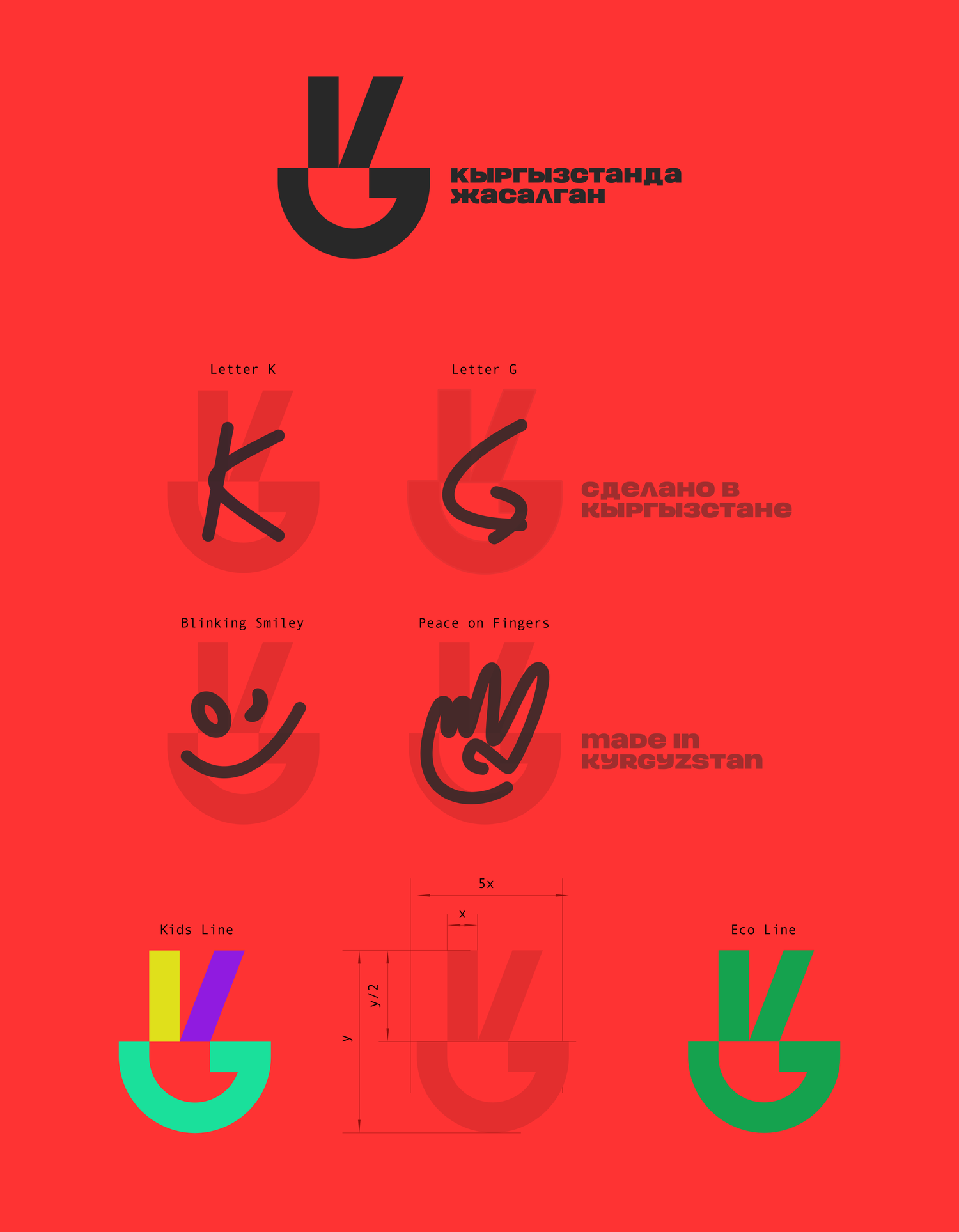
The mark brings together the letters K and G, a smile and a peace gesture. Simple geometry connects the country reference with an open, friendly character. It is designed as a standalone pictogram that remains recognisable at small sizes and in a single colour.
For makers, ease of adoption matters: the mark is designed to fit an existing pack or product identity. Concept mockups explore glass, metal, ceramics, fabric and labels, using different application methods. CE, EAC and Recycling informed its visual simplicity and reproducibility; this proposed mark serves to identify origin.
03/ The key visual: yellow and red stripes
The core visual device is deliberately simple: a yellow stripe and a red stripe. They follow the edge of a layout, frame a message or highlight a zone. The same principle can shape price tags, shelf wobblers, posters, shelf displays and in-store wayfinding.
The system is designed for retailers with different resources. A repeatable device and ready-to-use templates help even a small shop maintain the shared visual language. At the shelf, the message becomes the direct, familiar «Своё / Өзүбүздүкү» — our own.
04/ The strategy: mountains and pride
Made in Mountains is the central communication idea. Origin becomes a source of character: altitude, boldness, a distinctive standard and pride in what is made here. The theme supports different stories under a shared identity, from food to clothing and other categories.
In the honey advertising concept, «4572 meters above your average honey» connects mountain altitude with the idea of a higher product standard. Geography becomes the basis of a specific story and a memorable advertising message.
Geometric patterns extend the visual language. Alongside the mark, stripes and shared tone of voice, they provide material for packaging, exhibitions, merchandise and digital communications. The pitch proposes adapting messages for Kyrgyz, Russian and English audiences.
05/ Japainess
The courage to say: “Made in Mountains.”
We propose speaking about origin openly and with pride. Giving it a place in the name, the advertising and the character of the brand. Turning mountains into a source of memorable ideas, with pride shaping the tone of every message.
06/ A system designed to grow
The pitch proposes an open library of source files and templates, instructions for retailers, training and support for pilot implementations. This creates a route for independent makers and stores to adopt the mark and visual language consistently.
A concept developed for a pitch. This case presents the mark, key visual, communication and creative direction, and visualisations of the proposed system.